As a subscriber to the Farnam Street newsletter, I enjoy reading Shane’s articles about using various mental models from other disciplines to improve our decision-making. Reading about these mental models is fun, but I am cognizant of the fact that reading about something does not equate to learning it. The real measure of success for learning a mental model is: Can I reliably recall the relevant properties of this concept in a useful real-world scenario?
Since this definition of success hinges on succesful recall, it is an ideal candidate for spaced repetition software. Anki is a popular spaced repetition (flashcards) app which I have used in language-learning and technical contexts over the past few years. So the question then becomes: how can we best use Anki to facilitate the process of learning mental models?
Notes, fields, and cards, oh my!
Before we continue, it will be helpful to briefly review the terminology used by Anki, as there are some subtleties here. When you are reviewing, you work through a deck (like a folder, usually grouped by theme) of cards, each with a front and back side. But when you are creating flashcards, you actually do this by choosing a note type and adding information into the fields on that note. Each note type has associated card types, which are essentially templates built with HTML and CSS to determine which fields go where.
The default note type is called Basic and has only two fields: Front and Back. This basic note type has a single card type which displays those fields on the corresponding sides of a card. This is an intuitive place to start with spaced repetition, but it is also a skeuomorph for physical flashcards. With digital flashcards, there is no limit to the number of fields and card types we can have within a single note type.
A naive approach
One of my early learnings from making medicore anki cards is that memory is directional. Just because you can name a concept, doesn’t mean you can define it, and vice versa. So for almost any concept worth learning, we will want to ultimately generate multiple cards to test both recognition and production.
I started off by simply creating a bunch of Basic note cards for each mental model I wanted to memorize. As an example, here are four cards I created when learning about the Streetlight effect.
| Front | Back |
|---|---|
| What is the the Streetlight Effect? | An observational bias where a person who is searching for something looks only where it is easiest. |
| What is the name for An observational bias where a person who is searching for something looks only where it is easiest? | The Streetlight Effect |
| What is the implication of the Streetlight Effect? | We must be careful to focus our problem-solving efforts towards the area where the solution is likely to be rather than the area where we have the most data. |
What does this picture represent? | The Streetlight Effect |
I did this for 40+ concepts and mental models of the course of a few months. In the process, I noticed some recurring flaws with this approach.
Flaw #1: Card creation involves cognitive overhead
Every time we sit down to create new cards, we need to remember all the different front–back pairings above, and manually create a card for each pair. Suppose we occasionally we forget to make a particular card for a concept. When this happens, there is no easy way for us to discover its absence later.
The flexibility of pure Front ⟷ Back cards is useful when we are encoding unstructured information, but becomes a burden when many of our cards follow a similar schema. It took me a while to develop this schema, but now when I read about new concept I am always sub-conciously asking myself:
- How can I explain this concept to a five year-old?
- What is the key implication or use-case for this concept?
- When does this concept/tool/approach fail? When should I avoid it?
Once we have an implicit schema like this, we can leverage the power of note types and card types in Anki to automate our flashcard creation.
Flaw #2: There is boilerplate text
The above example cards each include some boilerplate text on the front of the card:
- What is…
- What is the name for…
- What is the implication of…
- What does this represent…
These chunks of text are necessary to prime our brain about what specific piece of information we are asking it to recall. But they require a non-trivial amount of time to verbally process before we can then move on to the actual act of recall. And after writing them 40+ times we will inevitably have some variation in wording, which further increases the cognitive burden. Ideally our card structure itself could signal what piece of information we are being asked to recall.
Flaw #3: It is difficult to refactor
One infrequently discussed element of spaced repetition learning is card refactoring. This is not a concern if we are using flashcards to memorize the birthdays of US presidents, as that information will never change. Our initial encoding of the information is probably good enough, even five years from now
But what if we are using spaced repetitition to learn compressible topics such as mathematics? In this case, we are almost never encoding raw factual information in our cards, but rather a snapshot of our current understanding of the topic. As we continue to develop our understanding in a topic and establish connections across disciplines, we will frequently notice that our previous understanding of a concept was imprecise or subtly wrong.
When we update our understanding, we should also update our flashcards, so that they remain relevant and valuable to us. With 5-10 disconnected cards for a topic floating around our Anki deck, it can be a burden to find and update all of the cards related to a particular topic. For example, you may have some cards related to the law of total probability, but you may also have a number of other cards which reference that concept. Simply searching for that text across all your decks will surface not just the concept cards, but also these other cards which mention the concept.
A note template for mental models
With the above criteria in mind, I built my own “concept” note type to attempt to address these issues. Here are a few screenshots to show what the cards look like on AnkiDroid. Below I explain a few of the features, and why I made particular design decisions.
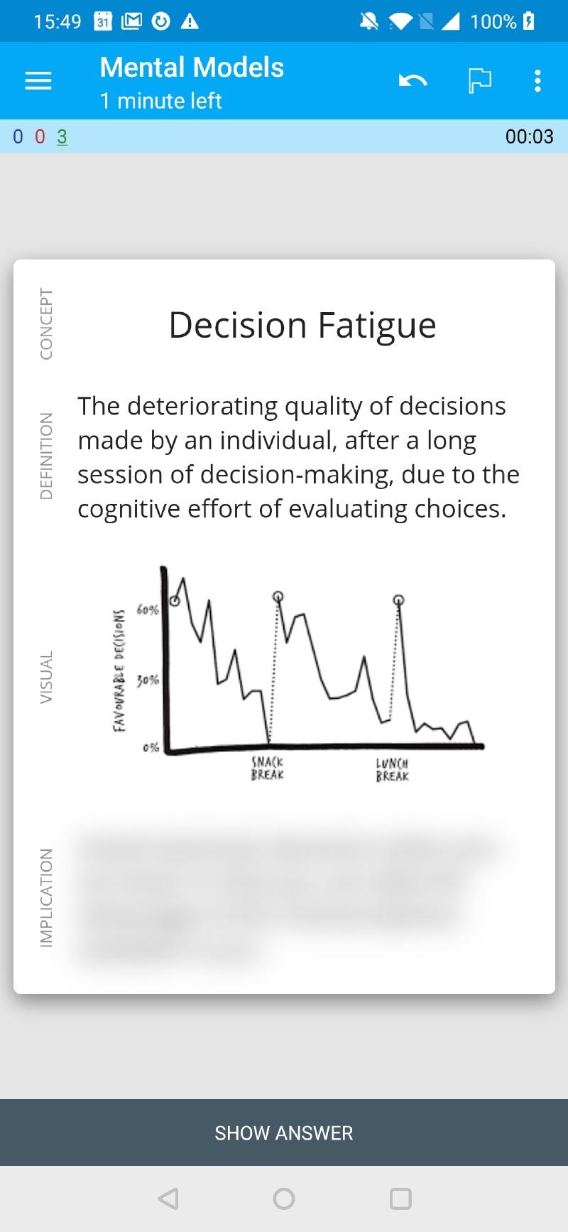
Concept → Implication
Definition → Concept
Visual → Concept
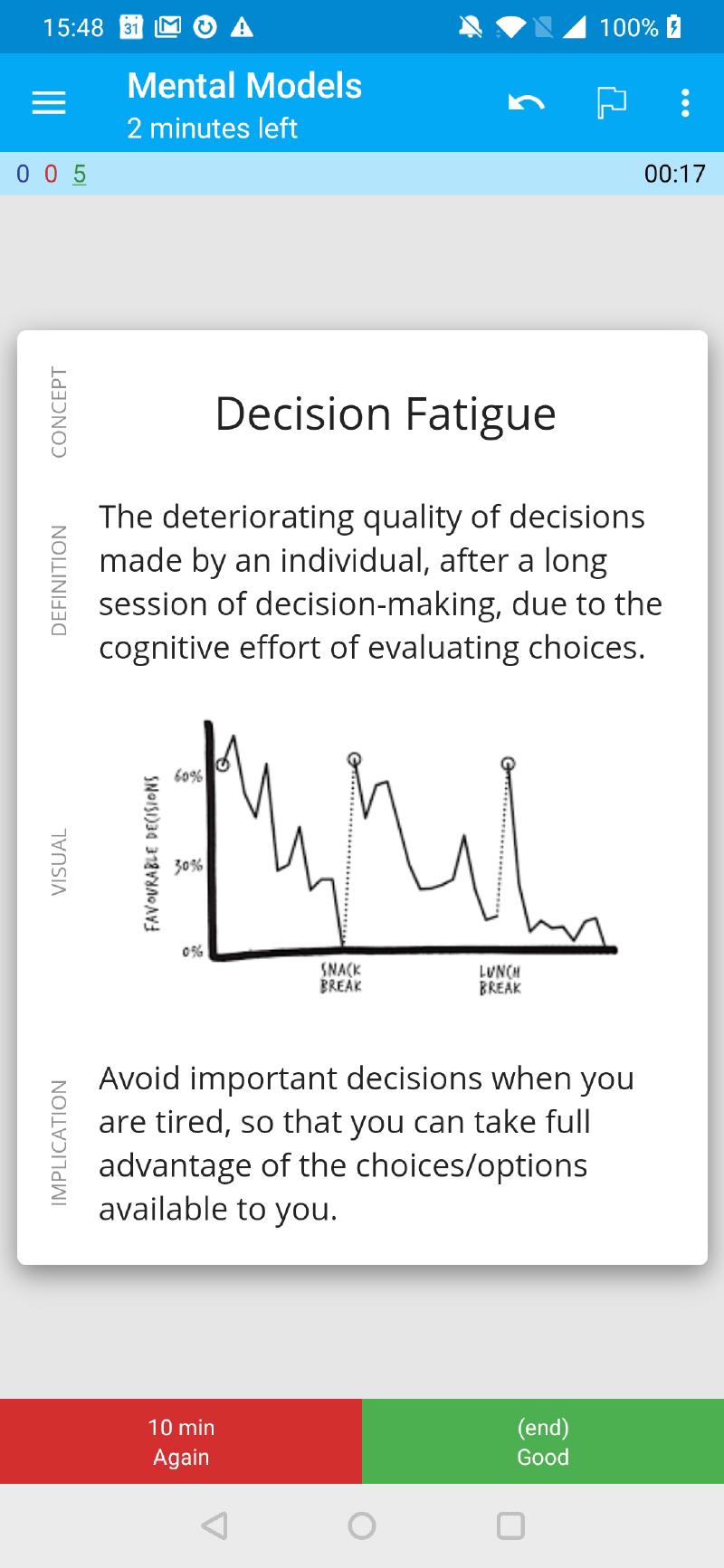
Full card revealed
Centered layouts with CSS Flexbox
Designing card layouts on Anki 2.0 was a pain, but since version 2.1, Anki uses a new rendering engine which supports modern web development techniques such as CSS Flexbox. Our core design makes use of flexbox to ensure that cards are centered both horizontally and vertically on the screen. On mobile, cards typically take up the full width, but on desktop they are limited to ~800px for better readability on wide screens. The goal here is to reduce cognitive overhead when rapidly reviewing many differnet cards.
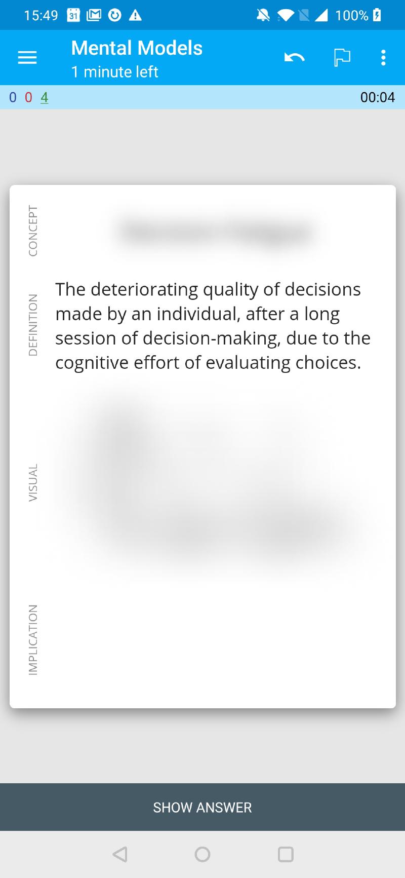
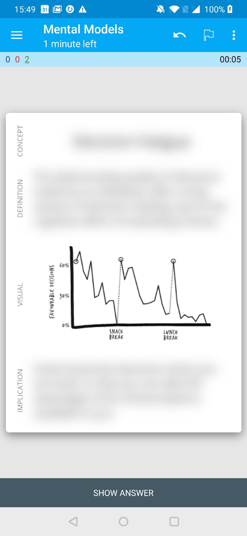
Blurred answers with global JavaScript
Rather than having six different Front Side and Back Side designs—one for each card type—I elected to use a single note layout across all cards, and then to simply blur the field I wish to recall. The back side of each card includes no new content, it just calls a javascript function which removes the blur from the recall field.
This reduces the overhead of managing 6x2=12 different HTML templates, enforces consistency, and further reduces cognitive overhead when reviewing. Since the location of the content does not change on answer reveal, there is no time required to grok the structure of the answer. There is also an implicit encoding of data type as location, which I found my brain picked up on subconciously after a few review sessions.
Creating cards
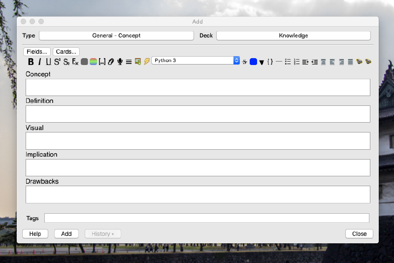
The template lives in a custom note type called Concept which contains five fields: name, description, visual, implication, drawbacks. It is okay if you do not use every field. There are six card types which use selective card generation to only create flashcards when the necessary fields are non-empty:
- Concept → Description
- Concept → Implication
- Concept → Drawbacks
- Description → Concept
- Visual → Concept
- Implication → Concept
The first three deal with recognition. Can we recall the specific details of the concept when directly prompted? The second three deal with production. Can we identify the correct concept from a description, visual representation, or implication / use-case. While the first three cards cover many academic use-cases, the final three are the ones which more directly influence our ability to recognize and apply mental models in a real-life context. So far, this approach feels like it has worked reasonably well.
I often add a note with only 2-3 fields, then come back and add another field or two a couple months later, when I have a more nuanced understanding of a concept. I experimented with additional fields, but found that these are the minimal set which cover 80% of my card generation needs. I’m not just invoking the 80/20 cliché here—I checked my Anki stats and found that I have a 4:1 ratio of these Concept cards to my more basic Q&A card, which I use for cards that don’t fit the mould.
How to download it
You can find the template on Github. There is no way to import/export a note type by itself, so the workaround is to import the sample deck, which contains the note type, the necessary CSS and Javascript, and also 30 example cards which showcase the template.
Known issues
This template is still somewhat a work-in-progress. Here are a couple issues that still need to be fixed. Feel free to send a PR on Github if you are interested in helping improve the template.
Flashing caused by MathJax
I have recently changed all of my math expressions from LaTeX to MathJax in Anki. It’s much nicer to work with, but one disadvantage is that it causes the cards to briefly “flash” when displayed, as the underlying markup is being typeset in real-time. Unfortunately I found this to be more noticable and annoying using this template, because the rest of the card is otherwise identical. Whereas on the basic card template, so much of the card changes on answer reveal that the typesetting is less noticeable.
Cards which are too large for mobile
If your card has a lot of text, some of it may be hidden below the fold when reviewing on the mobile app. I am considering adding some shadow styling to indicate when there is scrollable content on a card. But one could argue that if your card has too much text to fit onto a single screen, you should break up the card into more atomic units anyways.
Identifying links across topics
Anecdotally, I feel like I recognize connections between concepts and fields more frequently than I did before. One small hiccup I have not yet solved is how to link concepts across disciplines that are closely-related but perhaps not identical. For example, after reading books about behavioural psycology, the philosopy of Stoicism and cognitive behavioural therapy (CBTI), I have noticed they have many parallel concepts but with different terminology and subtly different implications.