Goal: Create a visual that makes it easy to digest/compare segmented percentages (binomial proportions) while accounting for uncertainty of small sample sizes.
import numpy as np
import pandas as pd
import matplotlib.pyplot as plt
import statsmodels.api as sm
Package      Version
-----------  ---------
python       3.9.12
numpy        1.21.5
pandas       1.4.2
matplotlib   3.5.1
statsmodels  0.13.2
Example data
np.random.seed(24)
example_data = (
pd.DataFrame({
'metric': ['Received rate', 'Open rate', 'Click rate', 'Purchase rate'] * 3,
'dimension': ['Group A'] * 4 + ['Group B'] * 4 + ['Group C'] * 4,
'k': (np.random.randint(25, 75, size=12)),
'n': 100
})
.set_index(['metric', 'dimension'])
.sort_index()
)
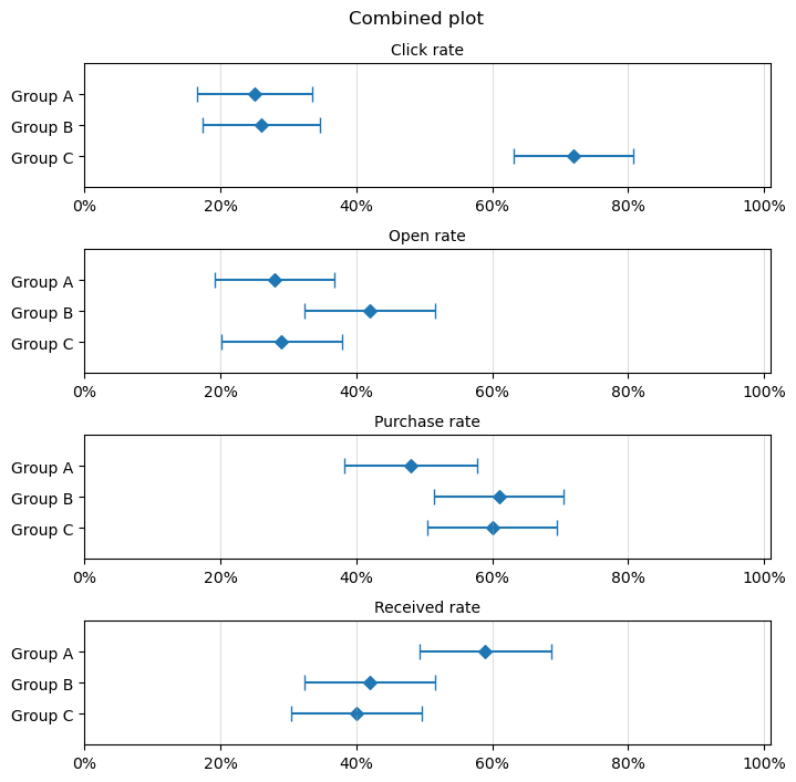
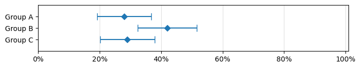
example_data
| k | n | ||
|---|---|---|---|
| metric | dimension | ||
| Click rate | Group A | 25 | 100 |
| Group B | 26 | 100 | |
| Group C | 72 | 100 | |
| Open rate | Group A | 28 | 100 |
| Group B | 42 | 100 | |
| Group C | 29 | 100 | |
| Purchase rate | Group A | 48 | 100 |
| Group B | 61 | 100 | |
| Group C | 60 | 100 | |
| Received rate | Group A | 59 | 100 |
| Group B | 42 | 100 | |
| Group C | 40 | 100 |
Single plot
import matplotlib.ticker as mticker

def plot_pct_with_conf_ints(df: pd.DataFrame, alpha=0.05, ax=None):
    """ Plot multiple binomial proportions (percentages) with error bars to represent the confidence intervals. """

    assert df.columns.tolist() == ['k', 'n']
    df = df.copy()
    df = df[::-1]  # reverse so that vertical order matches input df
    n_rows = df.shape[0]

    #################
    # CONFIGURE PLOT
    #################

    plt.style.use('classic')
    plt.style.use('default')

    plot_height = n_rows * 0.4

    if ax is None:
        _, ax = plt.subplots(figsize=(8, plot_height), dpi=100)

    ############
    # PLOT DATA
    ############

    x = (df['k'] / df['n']).values
    y = np.arange(n_rows)
    ax.scatter(x, y, marker='D')

    #################
    # PLOT INTERVALS
    #################

    abs_conf_ints = sm.stats.proportion_confint(df['k'].values, df['n'].values, alpha)
    rel_conf_ints = np.abs(abs_conf_ints-x)  # errorbar func expects relative differences (±)
    ax.errorbar(
        x=x, y=y,             # position of points
        xerr=rel_conf_ints,   # size (±) of error bar
        capsize=5,            # wing tips
        ls='none'             # prevent connecting points
    )

    ##################
    # AXIS FORMATTING
    ##################

    ax.set_xlim(0, 1.01)
    ax.set_ylim(-1, n_rows)

    ax.xaxis.grid(True, alpha=0.4)

    ax.set_yticks(np.arange(n_rows))
    ax.set_yticklabels(df.index.values)

    # Format x-ticks as percentages

    ticks_loc = ax.get_xticks().tolist()
    ax.xaxis.set_major_locator(mticker.FixedLocator(ticks_loc))
    ax.set_xticklabels(['{:.0%}'.format(x) for x in ax.get_xticks()])

    return ax


_ = plot_pct_with_conf_ints(example_data.loc['Open rate'])
Combined plot
def combined_plot(df: pd.DataFrame, title:str = None, hspace: float = 0.5):
    """ Combine multiple binomial plots into a single matplotlib figure. """

    n_subplots = len(df.index.levels[0])
    height_ratios = df.groupby(level=0).count().iloc[:, 0].values.tolist()

    fig, axes = plt.subplots(
        nrows=n_subplots,
        ncols=1,
        gridspec_kw={'height_ratios': height_ratios, 'hspace': hspace},
        figsize=(8, 8), dpi=100
    )

    for i, (dim, sub_df) in enumerate(df.groupby(level=0)):
        axes[i].set_title(dim, size='medium')
        sub_df = df.loc[dim]
        _ = plot_pct_with_conf_ints(sub_df, ax=axes[i])

    plt.suptitle(title, y=0.94)

combined_plot(example_data, title='Combined plot')