Some boilerplate code for producing histogram plots in Python. Mostly using seaborn, simply because it is much more pleasant to use than matplotlib for histgrams.
import numpy as np
import pandas as pd
import matplotlib.pyplot as plt
import seaborn as sns
Package     Version
----------  ---------
python      3.8.8
matplotlib  3.4.3
seaborn     0.11.1
Defaults
Seaborn
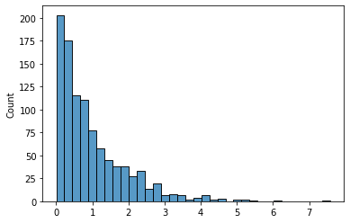
Here is what we get “out-of-the-box” from seaborn.histplot. I typically start here, because it has much more sensible defaults (bin width, etc.) than plt.hist, and ultimately returns a matplotlib object in the end anyways.
data = np.random.exponential(size=1000)
sns.histplot(data, kde=False);
Log scale
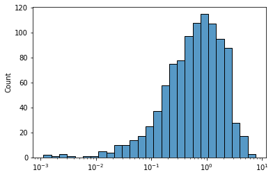
Suppose our data has some sort of long-tailed distribution—such as Exponential or Poisson—and is difficult to visualize on an absolute scale. We could get a better sense of “orders of magnitude” by performing a log transformation on the x-axis.
Passing log_scale=True to histplot does two things:
- It log transforms your data
- It changes the formatting of the x-axis labels
ax = sns.histplot(data, log_scale=True)
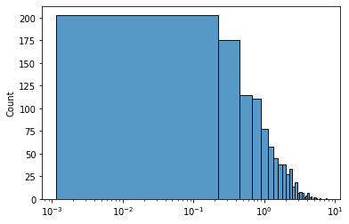
Alternatively, running ax.set_xscale('log') after plotting does the same, except that the bin widths are kept in linear scale.
ax = sns.histplot(data)
ax.set_xscale('log')
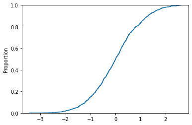
Cumulative (CDF)
Seaborn
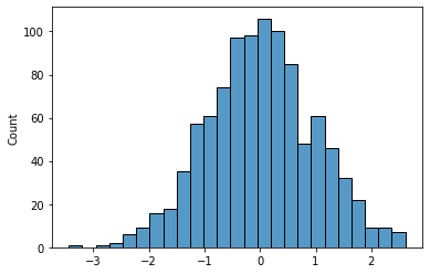
data = np.random.normal(size=1000)
sns.histplot(data, kde=False);
sns.ecdfplot(data)
<AxesSubplot:ylabel='Proportion'>
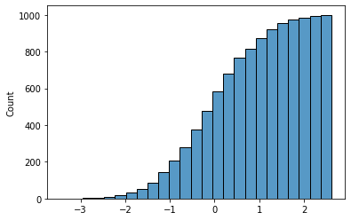
sns.histplot(data, line_kws={'weights': data}, cumulative=True);
Boilerplate
Tidy
We can tidy up this output a bit by hiding the y-axis, which is often irrelevant when our primary goal is to visualize the shape of a distribution. If your plot has a grid, use ax.yaxis.set_ticklabels([]) instead of ax.get_yaxis().set_visible(False) so that the horizontal grid lines remain.
def histogram(data: np.ndarray, **kwargs) -> (mpl.figure.Figure, mpl.axes.Axes):
    """ Plot a seaborn histogram (no KDE) with annotated summary stats. """

    # plot core date
    fig, ax = plt.subplots(figsize=(6, 4), dpi=100)
    sns.histplot(data, **kwargs)

    # formatting
    ax.get_yaxis().set_visible(False)

    return fig, ax

histogram(data, kde=False);
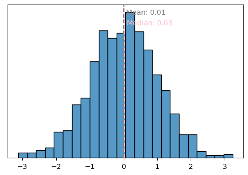
Annotate with summary stats
If we’re interested in the same of a distribution, we’re probably also interested in some summary statistics of the data. Rather than calculating these separately, we can display them in-line on the plot using annotations.
We generally want to leave a bit of padding between the vertical line and the text label, to improve readability. But we want this padding to be invariant to the scale of the data, so that the formatting looks consistent. We can achieve this by using the transform=ax.transAxes argument on ax.text, which lets us specify (x, y) position in relative coordinates [0, 1] rather than the coordinates of the data itself. This lets us specify formatting such as pad or vertical position relatively. But the horizontal position of the text is dependent on the data, so we need to convert the data coordinates to relative coordinates using ax.transLimits.transform((raw_value, 0))[0]. More details at Transformations Tutorial (matplotlib docs).
def annotate_histplot(ax: mpl.axes.Axes,
                      data: np.ndarray,
                      mean_color='grey',
                      median_color='pink',
                      pad=0.01,
                      precision=2,
                      log_transform=False) -> None:
    """ Draw lines and annotate text on a histogram to indicate mean and median values. """

    text_defaults = dict(va='center', ha='left', transform=ax.transAxes)
    mean = mean_label = np.mean(data)
    median = median_label = np.median(data)

    if log_transform:
        mean, mean_label = np.log10(mean), mean
        median, median_label = np.log10(median), median

    mean_label = np.round(mean_label, precision)
    median_label = np.round(median_label, precision)

    # annotate mean
    ax.axvline(mean, linestyle='--', color=mean_color)
    rel_pos = ax.transLimits.transform((mean, 0))[0]
    ax.text(rel_pos+pad, 0.95, f'Mean: {mean_label}', color=mean_color, **text_defaults)

    # annotate median
    ax.axvline(median, linestyle='--', color=median_color)
    rel_pos = ax.transLimits.transform((median, 0))[0]
    ax.text(rel_pos+pad, 0.88, f'Median: {median_label}', color=median_color, **text_defaults)


_, ax = histogram(data, kde=False)
annotate_histplot(ax, data)