Netflix recently posted an article on their tech blog titled Reimagining Experimentation Analysis at Netflix. Most of the post is about their experimentation infrastructure, but their example of a visualization of an experiment result caught my eye. A/B test results are notoriously difficult to visualize in an intuitive (but still correct) way. I’ve searched for best practices before, and the the only reasonable template I could find is built for Excel, which doesn’t fit my python workflow.
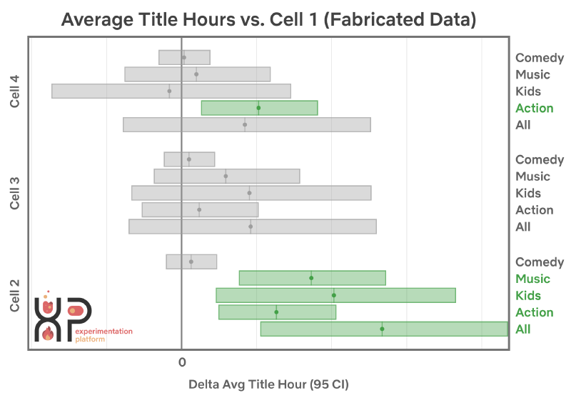
It might take a couple seconds to visually parse this visualization at first glance. I don’t think that’s because it’s complicated per se, but rather because the viz itself contains so much information. After you are used to the format, it’s hard to think of a way to convey a higher density of decision-making-relevant information in such a small space. There are a few things that make this a particularly good visualization for the result of an experiment.
Why it is awesome
It frames many “tests” within the context of a single experiment
The terms experiment and test are often used interchangeably across product teams, no doubt in part due to the terminology around A/B testing. But in the context of a single experiment—in which we experiment by trying something new—we may perform a number of different statistical tests. While each individual test has its own confidence level, we must be careful to adjust our claims of confidence on the experiment level, else we vall fictim to the multiple comparisons problem.
Even if you don’t apply any sort of quantitative correction—to guarantee some global family-wise error rate (FWER) or false discovery rate (FDR)—having all the tests shown together adds useful context for the reader. Suppose you hear the following statement during a company all-hands:
We saw a significant increase in viewing hours for the Action genre in position four.
This statement agrees with the above example plot, but it isn’t particularly insightful. Should we prefer the Action genre for this position over others genres? Or is this the ideal position for that genre across all possible genres? Perhaps both? Small verbal descriptions of specific outcomes from experiments like this tend to get taken out of context. When this happens, their utility decreases, and their risk of being “misused” increases. Unfortunately I have observed that these sort of “snippets” are frequently used as ammunition by some decision-makers to support their a priori preferred choice.
It emphasizes intervals over point estimates (and p-values)
The past few years have seen signficiant backlash (pun intended) against the use and misuse of p-values in academia. Today’s social scientists are all familiar with publication bias and the replication crisis. Yet when a n A/B test is presented in a tech company boardroom, the first question is still often Is this result significant?.
The Netflix visualization replaces the role of p-values with a visual depiction of some confidence interval, whose colour changes depending on whether or not it includes zero. Additionally, although point estimates are shown within each interval, they are visually de-emphasised within the overall context of the visualization. I’m guessing that Netflix removed x-axis labels to avoid sharing confidental data, but even with those included, it limits people to making statements such as “we expect somewhere between a 1-2% improvement” rather than “we expect a 1.27% improvement”. Using two decimals of precision when our confidence interval is 100x as wide the estimate itself is superfluous and gives us a false sense of confidence in our results.
The contextual info “stays together” in a single shareable image
All of the above properties of a good experiment visualization could also be fulfilled by a nicely designed Tableau dashboard. But what should you do after the experiment ends, and you want to share or save the result for later? Your company’s dashboards are always changing after all, so you can’t guarantee the data will be there a year from now if you want to reference it. So you take a screenshot.
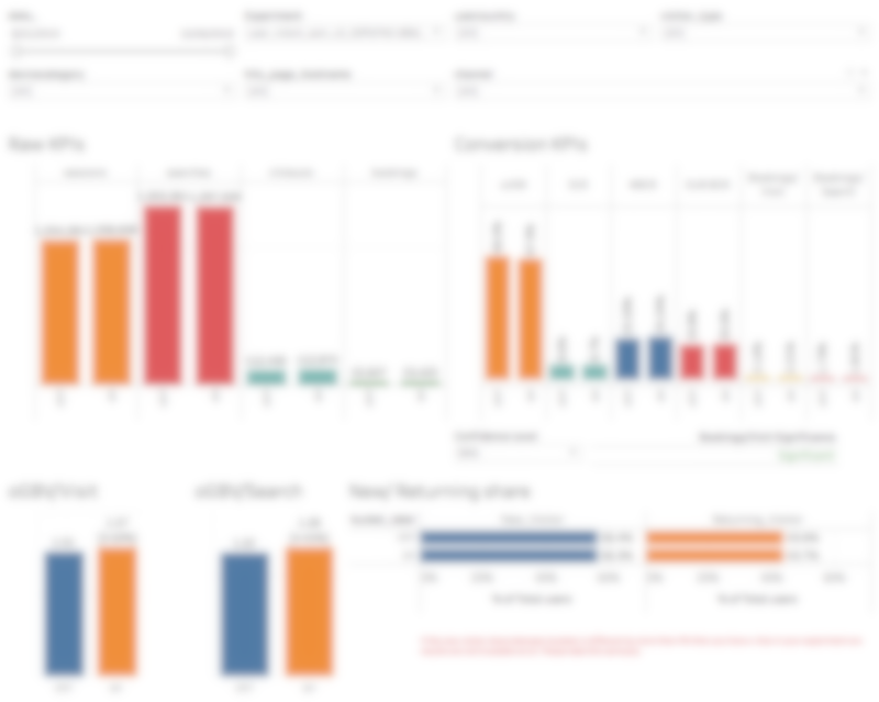
Detailed dashboards are difficult to archive or share
Well this is unfortunate. In order to capture the key parts of the result, you’ve had to take a nearly fullscreen grab of the dashboard. You can throw this in a slide deck somewhere, but you can’t expect anyone to read it. And if they do, you can’t expect them to reach the same conclusion as you did. In contrast, Netflix’s visualization outputs a story. Better yet, it’s a story contained in a single copy-paste-able sharable png file. This ensures that the nuance of your analysis does not get lost in transit as it is shared over Slack and email.
Rolling our own visualization function
Unfortunately I have not been able to surface any sort of open source libraries under the name “Netflix Vizkit”, so I decided to recreate my own version using Matplotlib. The function takes as input a pandas dataframe with either a single or multilevel index, and three columns: uplift, std_err, and alpha. If you are running a large number of tests, it would be prudent to first run your dataframe through your procedure of choice to correct for multiple comparisons. I’ll skip that for the purposes of this example.
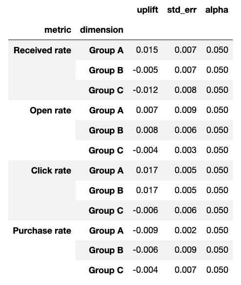
For this example, I’ve populated a dataframe with fake results corresponding to an email campaign in which we tested three variants and measured four different conversion rates for each. You could also pass in a dataframe with a single level of index, you’ll just get everything plotted on one axis instead of four separate axes.
plot_experiment_results(
  df=example_data,
  title='Example email campaign (α=0.10)',
  sample_size=123456,
  combine_axes=False)
There are a couple additional parameters in there to add context to the plot, including a title and sample size context line. Remember, we want our output to stand by itself as a record of the outcome of the experiment! This function generates the plot below.
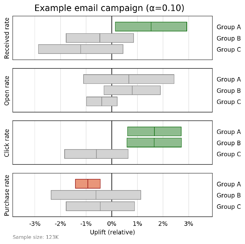
If you want to more closely match the Netflix plot, you can pass the paramete combine_axes=True to merge groups together into a single axis. I found this a bit less easy to visually parse, so I usually leave them separate.