This notebook contains boilerplate code for producing various types of bar charts, using various python plotting packages incl. pandas, matplotlib, and seaborn.
Generally:
- Plotting from
pandasinvolves simply callingdf.plot()with some variation of parameters. - Plotting directly from
matplotlibgives less polished of an output (out-of-the-box), and is much more verbose, but provides infinite customization. seabornis the least verbose and most beautiful, but often expects the input data to be in an unintuitive format.
import numpy as np
import pandas as pd
import matplotlib.pyplot as plt
import seaborn as sns
import bokeh
Package     Version
----------  ---------
python      3.9.12
matplotlib  3.5.1
seaborn     0.11.2
bokeh       2.4.2
1D
data_1d = pd.Series([0.2, 0.3, 0.1, 0.4], index=['A', 'B', 'C', 'D'])
data_1d
A    0.2
B    0.3
C    0.1
D    0.4
dtype: float64
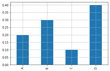
Vertical
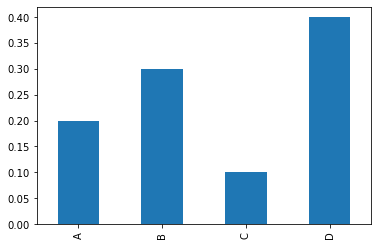
pandas
data_1d.plot(kind='bar');
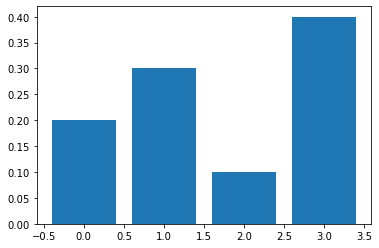
matplotlib
plt.bar(x=range(4), height=data_1d);
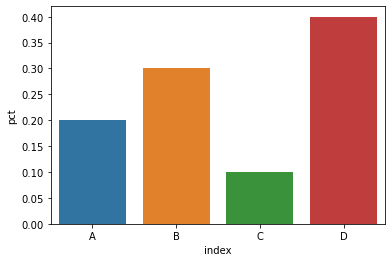
seaborn
seaborn.barplot() expects a DataFrame as input, with x, y args specifying the column names of said data.
data_1d_df = data_1d.rename('pct').reset_index()

_ = sns.barplot(x='index', y='pct', data=data_1d_df)
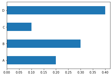
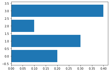
Horizontal
pandas
data_1d.plot(kind='barh');
matplotlib
plt.barh(y=range(4), width=data_1d);
seaborn
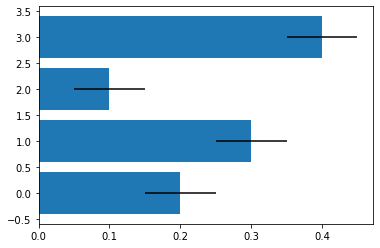
Error bars
matplotlib
Different ways of specifying error bars — Matplotlib 3.5.2 documentation
plt.barh(y=range(4), width=data_1d, xerr=0.05);
2D
Bar charts with multiple lines per group.
data_2d = pd.DataFrame({
    'X': [0.2, 0.3, 0.1, 0.4],
    'Y': [0.4, 0.2, 0.3, 0.1]
    }, index=['A', 'B', 'C', 'D'])

data_2d
| X | Y | |
|---|---|---|
| A | 0.2 | 0.4 |
| B | 0.3 | 0.2 |
| C | 0.1 | 0.3 |
| D | 0.4 | 0.1 |
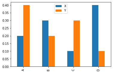
Normal
pandas
data_2d.plot(kind='bar');
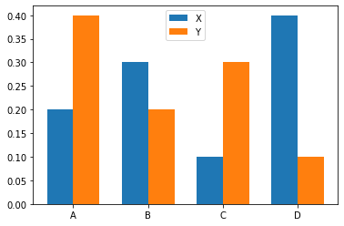
matplotlib
fig, ax = plt.subplots()

labels = data_2d.index.tolist()
x = np.arange(len(labels))
width = 0.35

_ = ax.bar(x-width/2, data_2d['X'], width, label='X')
_ = ax.bar(x+width/2, data_2d['Y'], width, label='Y')

_ = ax.set_xticks(x)
_ = ax.set_xticklabels(labels)

plt.legend();
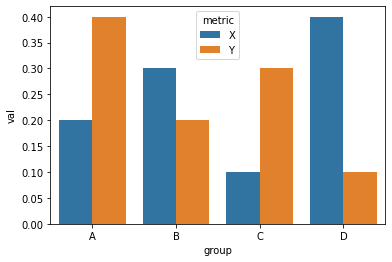
seaborn
to_viz = (
    data_2d
    .stack()
    .rename_axis(('group', 'metric'))
    .rename('val')
    .reset_index()
)

#to_viz

_ = sns.barplot(x='group', y='val', hue='metric', data=to_viz)
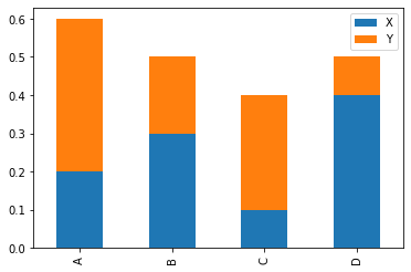
Stacked
pandas
data_2d.plot(kind='bar', stacked=True);
Gotchas with pandas
Put grid behind main elements
The DataFrame.plot() function takes a grid=True argument, but by default it displays above the bars/lines—which looks terrible.
data_1d.plot(kind='bar', grid=True);
You can fix this by assigning the return value to ax, then running ax.set_axisbelow(True) afterwards.
ax = data_1d.plot(kind='bar', grid=True) # or ax.grid()
ax.set_axisbelow(True)
