import numpy as np
import pandas as pd
import matplotlib.pyplot as plt
import seaborn as sns
Package     Version
----------  ---------
python      3.8.8
matplotlib  3.4.3
seaborn     0.11.1
Plot types
Scatter plot
Basic
def plot_something(srs: pd.Series) -> None:
    fig, ax = plt.subplots(figsize=(4, 4), dpi=100)

    ax.scatter(srs.index, srs.values, label='', zorder=2)

    ax.set_title('')
    ax.set_ylabel('')
    ax.set_xlabel('')

    ax.grid()
    plt.savefig('chart.png')

srs = pd.Series(np.random.randint(20, size=10))
plot_something(srs)
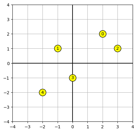
Labelled scatter plot near intercept
Here’s an example of a simple scatter plot using labeled data points centered around the intercept. I initially wrote this as a base for a function which visualizes how the k-means algorithm works step-by-step. A couple things to note:
- We set higher
zorderfor the elements we want to appear “on top” of others - The core
ax.scatterfunction takes an array of data points, butax.annotatedoes not, so we need to loop.
data = np.asarray([
    [2, 2],
    [-1, 1],
    [3, 1],
    [0, -1],
    [-2, -2]
])

def scatter_plot_near_intercept(data):
    fig, ax = plt.subplots(figsize=(5, 5), dpi=100)

    # Format grid
    ax.grid(zorder=1)
    ax.axvline(0, c='black', zorder=2)
    ax.axhline(0, c='black', zorder=2)
    ax.set_xlim(-4, 4)
    ax.set_ylim(-4, 4)

    # Plot data points
    ax.scatter(*data.T, s=256, c='yellow', edgecolors='black', zorder=3)

    for i, (x, y) in enumerate(data):
        ax.annotate(i, (x, y), size=10, ha='center', va='center')

scatter_plot_near_intercept(data)
Plotting functions
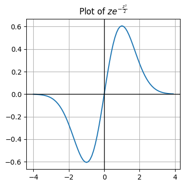
Plot a pdf
x = np.arange(-4, 4, 0.1)

def plot_pdf(x, y, title=None) -> None:
    fig, ax = plt.subplots(figsize=(4, 4), dpi=100)

    ax.plot(x, y)

    ax.set_title(title)
    ax.set_ylabel('')
    ax.set_xlabel('')
    ax.grid()
    ax.axvline(0, c='black', linewidth=1, zorder=2)
    ax.axhline(0, c='black', linewidth=1, zorder=2)
    plt.savefig('chart.png')

plot_pdf(x, x*np.exp(-x**2/2), r'Plot of $z e^{-\frac{z^2}{2}}$')
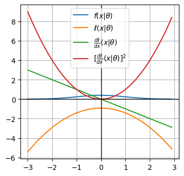
Plot multiple pdfs
from scipy.stats import norm

def plot_pdfs(x, pdfs: dict) -> None:
    fig, ax = plt.subplots(figsize=(4, 4), dpi=100)

    for label, pdf in pdfs.items():
        ax.plot(x, pdf, label=label)

    ax.set_title('')
    ax.set_ylabel('')
    ax.set_xlabel('')
    ax.legend(loc='best')
    ax.grid()
    ax.axvline(0, c='black', linewidth=1, zorder=2)
    ax.axhline(0, c='black', linewidth=1, zorder=2)
    plt.savefig('chart.png')

x = np.arange(-3, 3, 0.1)
log_lk = lambda z: -(1/2)*np.log(2*np.pi) - z**2/2
dldz = lambda z: -z
dldz_sqr = lambda z: z**2

pdfs = {
    r'$f(x|\theta)$': norm.pdf(x),
    r'$\ell(x|θ)$': log_lk(x),
    r'$\frac{d \ell}{dx}(x|θ)$': dldz(x),
    r'$[\frac{d \ell}{dx}(x|θ)]^2$': dldz_sqr(x)
}

plot_pdfs(x, pdfs)
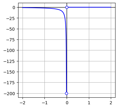
Discontinuous function
def plot_discontinuous_function(x, y, discontinuities=None, title=None) -> None:
    fig, ax = plt.subplots(figsize=(4, 4), dpi=100)

    for dc in discontinuities:
        x_seg = x[x<dc]
        y_seg = np.compress(x<dc, y)
        ax.plot(x_seg, y_seg, color='blue', zorder=3)
        ax.scatter(x_seg[-1], y_seg[-1], marker='o', zorder=4, facecolor='white', edgecolor='blue')

    # plot data between final discontinuity and end of series
    x_seg = x[x>dc]
    y_seg = np.compress(x>dc, y)
    ax.plot(x_seg, y_seg, color='blue', zorder=3)
    ax.scatter(x_seg[0], y_seg[0], marker='o', zorder=4, facecolor='white', edgecolor='blue')

    ax.set_title(title)
    ax.set_ylabel('')
    ax.set_xlabel('')
    ax.grid()
    ax.axvline(0, c='black', linewidth=1, zorder=2)
    ax.axhline(0, c='black', linewidth=1, zorder=2)
    plt.savefig('chart.png')


x = np.arange(-2, 2, 0.01)
y = 1/x - 1/np.abs(x)

plot_discontinuous_function(x, y, [0], r'')
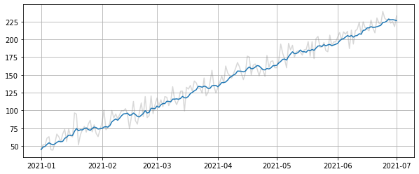
Time series
def plot_time_series(srs: pd.Series) -> None:
    """ Plot a simple time series (with moving average) using matplotlib """
    fig, ax = plt.subplots(figsize=(10, 4))
    ax.grid(True)
    fig.set_facecolor('white')
    ax.plot(srs, color='tab:grey', alpha=0.3)
    ma = srs.rolling(window=7, min_periods=1).mean()
    ax.plot(ma, color='tab:blue')


idx = pd.date_range('2021-01-01', '2021-07-01')

data = np.arange(50, 50+len(idx)) + np.random.normal(0, 10, size=len(idx))

srs = pd.Series(data, index=idx)

plot_time_series(srs)
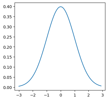
Formatting
from scipy.stats import norm

def basic_plot():
    fig, ax = plt.subplots(figsize=(4, 4), dpi=100)

    x = np.arange(-3, 3, 0.1)
    y = norm.pdf(x)
    ax.plot(x, y)

    return fig, ax

basic_plot()
(<Figure size 400x400 with 1 Axes>, <AxesSubplot:>)
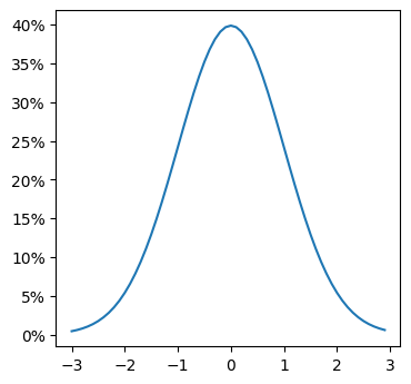
Legend
Axis formatting
Percent
https://matplotlib.org/stable/api/ticker_api.html#matplotlib.ticker.PercentFormatter
fig, ax = basic_plot()

import matplotlib.ticker as mtick
ax.yaxis.set_major_formatter(mtick.PercentFormatter(xmax=1, decimals=0))
from matplotlib.ticker import FuncFormatter

def currency(x, pos):
    'The two args are the value and tick position'
    if x >= 1000000:
        return '${:1.1f}M'.format(x*1e-6)
    return '${:1.0f}K'.format(x*1e-3)

formatter = FuncFormatter(currency)
ax.xaxis.set_major_formatter(formatter)
Dual Y axis
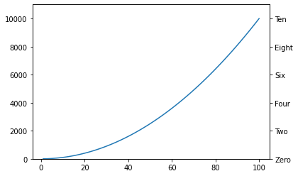
def add_relabelled_y_axis_to_right_side(ax, new_labels: list):
    """ Add a set of labels to the RHS of a plot, to aid in interpretability. """
    label_objs = list(ax.get_yticklabels())
    for label, orig in zip(label_objs, new_labels):
        label._text = orig

    # create a new y-axis on RHS
    ax2 = ax.twinx()

    # Copy tick locations
    _ = ax2.set_yticks(ax.get_yticks())

    # Copy tick labels
    _ = ax2.set_yticklabels(label_objs)

    # Copy axis limits
    _ = ax2.set_ylim(ax.get_ylim())

    # Resize RHS ticks to match LHS
    if 'labelsize' in ax.yaxis._major_tick_kw:
        label_size = ax.yaxis._major_tick_kw['labelsize']
        for tick in ax2.yaxis.majorTicks:
            tick.label2.set_fontsize(label_size)

    return ax


fig, ax = plt.subplots()
x = np.arange(1, 101)
ax.plot(x, x**2)
ax.set_ylim(0, 11000)

add_relabelled_y_axis_to_right_side(ax, ['Zero', 'Two', 'Four', 'Six', 'Eight', 'Ten']);
def dual_axis_line_chart(
    x: pd.Series,
    y1: pd.Series,
    y2: pd.Series,
    title: str = None,
    ylabel: str = None,
    xlabel: str = None,
) -> None:
    """ """
    fig, ax1 = plt.subplots(figsize=(9, 6))
    ax1.plot(x, y1)
    ax2 = ax1.twinx()
    ax2.plot(x, y2)

    if title:
        ax1.set_title(title)
    if ylabel:
        ax1.set_ylabel(ylabel)
    if xlabel:
        ax1.set_xlabel(xlabel)
Multiple plots
Layouts
Multiple rows and columns
# larger grid
fig, axes = plt.subplots(
    figsize=(6, 6),
    nrows=2,
    ncols=2,
    sharex=True,
    sharey=True,
    gridspec_kw={'wspace': 0.1},
    dpi=100
)

axes = axes.flat
Unqual sized
fig, (ax1, ax2) = plt.subplots(
    nrows=2,
    sharex=True,
    gridspec_kw={'height_ratios': [3, 1]},
    figsize=(18, 9),
    dpi=100
)
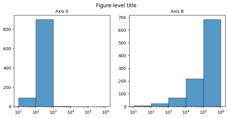
Boilerplate
# Set up figure

fig, axes = plt.subplots(
    figsize=(9, 4),
    nrows=1,
    ncols=2,
    gridspec_kw={'top': 0.88},
    dpi=100
)

ax1, ax2 = list(axes.flat)
plt.style.use('default')
_ = fig.suptitle('Figure-level title')


# Generate data

x = np.arange(1, 1001)
srs_A = pd.Series(x, index=x)
srs_B = pd.Series(x**2, index=x)


# Axis A

_ = sns.histplot(
    srs_A,
    log_scale=True,
    linewidth=0.5,
    bins=[1, 2, 3, 4, 5, 6],
    ax=ax1
)

_ = ax1.set_title(f'Axis A', size=10)
_ = ax1.set_xlabel('')
_ = ax1.set_ylabel('')


# Axis B

_ = sns.histplot(
    srs_B,
    log_scale=True,
    linewidth=0.5,
    bins=[1, 2, 3, 4, 5, 6],
    ax=ax2
)

_ = ax2.set_title(f'Axis B', size=10)
_ = ax2.set_xlabel('')
_ = ax2.set_ylabel('')
Human-readable numbers
Proof of concept
from math import log, floor

def human_format(number):
    """ Source: https://stackoverflow.com/questions/579310/formatting-long-numbers-as-strings-in-python/45846841 """
    units = ['', 'K', 'M', 'B']
    k = 1000
    try:
        magnitude = int(floor(log(number, k)))
        return f'{number/k**magnitude:.0f}{units[magnitude]}'
    except ValueError:
        return '0'

for x in range(1, 12):
    print(f'{10**x:12} {human_format(10**x)}')
          10 10
         100 100
        1000 1K
       10000 10K
      100000 100K
     1000000 1M
    10000000 10M
   100000000 100M
  1000000000 1B
 10000000000 10B
100000000000 100B
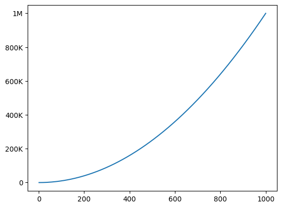
In practice
from math import floor, log
from matplotlib.ticker import FuncFormatter

# generate dummy plot
fig, ax = plt.subplots()
x = np.arange(1, 1001)
ax.plot(x, x**2)
ax.ticklabel_format(style='plain') # disable scientific notation

def human_format(number, pos):
    units = ['', 'K', 'M', 'B']
    k = 1000
    try:
        magnitude = int(floor(log(number, k)))
        return f'{number/k**magnitude:.0f}{units[magnitude]}'
    except ValueError:
        return '0'

# apply formatter
ax.yaxis.set_major_formatter(FuncFormatter(human_format))
Unsorted
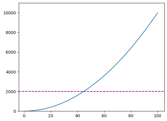
fig, ax = plt.subplots()
x = np.arange(1, 101)
ax.plot(x, x**2)
ax.set_ylim(0, 11000)
ax.axhline(2000, linestyle='--', color='purple')
<matplotlib.lines.Line2D at 0x7f7f018f9700>
Other
Auto-tilt x-axis labels
fig.autofmt_xdate()
Change interval of dates on x-axis
import matplotlib.dates as mdates
ax.xaxis.set_major_locator(mdates.MonthLocator(interval=1))
ax.xaxis.set_major_formatter(mdates.DateFormatter('%Y-%m-%d'))
Further reading
Real Python: Python Plotting With Matplotlib – Great introductory resource, with an explanation of the two different APIs, which is a key source of confusion for new users.
Python Data Science Handbook: Visualization with Matplotlib – Collection of 10+ notebooks with details on how to achieve specific tweaks.