import numpy as np
import pandas as pd
import matplotlib.pyplot as plt
import seaborn as sns
import bokeh
Package     Version
----------  ---------
python      3.8.8
matplotlib  3.4.3
seaborn     0.11.1
bokeh       2.3.2
import random
from IPython.core.display import HTML
from bokeh.plotting.figure import Figure
from bokeh.plotting import figure, show, reset_output, save
from bokeh.io import output_notebook, output_file

output_notebook(hide_banner=True)

def hugo_safe_render(fig: Figure) -> HTML:
    """ Save bokeh plot as HTML and re-embed into notebook, so that it also renders in Hugo markdown. """
    reset_output()
    name = f'{random.getrandbits(32)}.html'
    output_file(name)
    _ = save(fig)

    return HTML(f'<embed type="text/html" src="{name}" width="100%" height="{int(fig.height+100)}"></embed>')
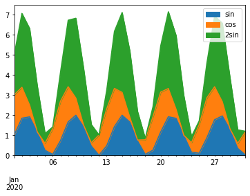
Stacked area chart
Generate dummy data
x = pd.date_range('2020-01-01', '2020-01-31')
y = np.sin(range(len(x)))

df = pd.DataFrame({
    'sin': np.sin(range(len(x))) + 1,
    'cos': np.cos(range(len(x))) + 1,
    '2sin': (np.sin(range(len(x))) + 1) * 2,
}, index=x)

df.head()
| sin | cos | 2sin |
|---|
| 2020-01-01 | 1.000000 | 2.000000 | 2.000000 |
|---|
| 2020-01-02 | 1.841471 | 1.540302 | 3.682942 |
|---|
| 2020-01-03 | 1.909297 | 0.583853 | 3.818595 |
|---|
| 2020-01-04 | 1.141120 | 0.010008 | 2.282240 |
|---|
| 2020-01-05 | 0.243198 | 0.346356 | 0.486395 |
|---|
pandas
bokeh
from bokeh.palettes import brewer
from bokeh.plotting import figure, show
from bokeh.io import output_notebook
from bokeh.models import DataRange1d, HoverTool, DatetimeTickFormatter

output_notebook(hide_banner=True)

fig = figure(
    plot_height=200,
    sizing_mode='scale_width',
    x_axis_type='datetime',
    # get rid of gap on x-axis
    x_range=DataRange1d(start=x.min(), end=x.max())
)

names = df.columns.tolist()

fig.varea_stack(
    stackers=names,
    x='index',
    color=brewer['Spectral'][3],
    legend_label=names,
    source=df
)

# workaround for using HoverTool → https://stackoverflow.com/a/60895524/4866803
fig.vline_stack(
    stackers=names,
    x='index',
    color=brewer['Spectral'][3],
    legend_label=names,
    source=df
)

fig.grid.minor_grid_line_color = '#eeeeee'
fig.legend.orientation = "horizontal"
fig.legend.background_fill_color = "#fafafa"
fig.xaxis.formatter = DatetimeTickFormatter(
    months=['%b %Y'],
    days=['%b %d']
)

fig.add_tools(HoverTool(
    tooltips=[
        ('Date', '@index{%F}'),
        ('Name', '$name'),
        ('Value', '@$name')
    ],
    formatters={'@index': 'datetime'},
    ))

hugo_safe_render(fig)
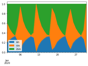
Normalized stacked area chart
Generate data
norm_df = df.apply(lambda x: x/x.sum(), axis=1)
norm_df.head()
| sin | cos | 2sin |
|---|
| 2020-01-01 | 0.200000 | 0.400000 | 0.400000 |
|---|
| 2020-01-02 | 0.260657 | 0.218028 | 0.521315 |
|---|
| 2020-01-03 | 0.302499 | 0.092503 | 0.604998 |
|---|
| 2020-01-04 | 0.332362 | 0.002915 | 0.664723 |
|---|
| 2020-01-05 | 0.226031 | 0.321908 | 0.452061 |
|---|
pandas
bokeh
from bokeh.plotting.figure import Figure

def bokeh_normalized_area_chart(df: pd.DataFrame) -> Figure:
    """ Use bokeh to plot a normalized stack area chart.

    Notes
    - Tooltips on hover
    - Expects df with DateTimeIndex and dimensions as columns

    """

    from bokeh.palettes import brewer
    from bokeh.plotting import figure, show
    from bokeh.io import output_notebook
    from bokeh.models import DataRange1d, HoverTool, DatetimeTickFormatter, NumeralTickFormatter, Legend

    output_notebook(hide_banner=True)

    fig = figure(
        plot_height=200,
        sizing_mode='scale_width',
        x_axis_type='datetime',
        # get rid of gap on x-axis
        x_range=DataRange1d(start=df.index.min(), end=df.index.max()),
        y_range=DataRange1d(start=0, end=1)
    )

    legend = Legend()
    fig.add_layout(legend, 'right')
    fig.legend.orientation = 'vertical'
    fig.legend.location = 'top_left'
    fig.legend.label_text_font_size = '8pt'
    fig.legend.background_fill_color = "#fafafa"

    names = df.columns.tolist()

    fig.varea_stack(
        stackers=names,
        x='index',
        color=brewer['Spectral'][len(names)],
        legend_label=names,
        source=df
    )

    # workaround for using HoverTool → https://stackoverflow.com/a/60895524/4866803
    fig.vline_stack(
        stackers=names,
        x='index',
        color=brewer['Spectral'][len(names)],
        legend_label=names,
        source=df
    )


    fig.grid.minor_grid_line_color = '#eeeeee'

    fig.xaxis.formatter = DatetimeTickFormatter(
        months=['%b %Y'],
        days=['%b %d']
    )

    fig.yaxis.formatter = NumeralTickFormatter(format='0 %')

    fig.add_tools(HoverTool(
        tooltips=[
            ('Date', '@index{%F}'),
            ('Name', '$name'),
            ('Value', '@$name{%0.2f}')
        ],
        formatters={'@index': 'datetime', '@$name' : 'printf'}
        ))

    return fig

fig = bokeh_normalized_area_chart(norm_df)
hugo_safe_render(fig)