Create a waterfall chart. Loosely based on horizontal bar chart, but modified to accentuate the sequential effect of different “stages” on an accumulated quantity.
Imports
import numpy as np
import pandas as pd
import matplotlib.pyplot as plt
Package     Version
----------  ---------
python      3.8.8
matplotlib  3.3.4
Generate fake data
data = pd.Series({
    'Clicked link': 1,
    'Page loaded': 0.8,
    'Clicked button': 0.4,
    'Clicked *at least one* button': 0.5,
    'Signed up': 0.2
}).multiply(200).astype(int)

data
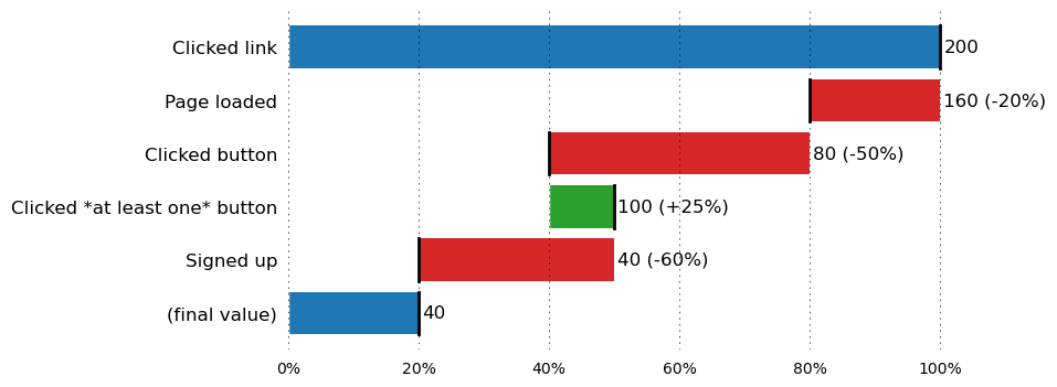
Clicked link                     200
Page loaded                      160
Clicked button                    80
Clicked *at least one* button    100
Signed up                         40
dtype: int64
Prep for visualization
def prep_data_for_waterfall_chart(srs: pd.Series) -> pd.DataFrame:
    """ Based a series input, calculate parameters necessary for waterfall chart. """

    # initial value
    output = [{
        'label': srs.index[0],
        'start': 0,
        'end': srs[0],
        'color': 'tab:blue',
        'val': srs[0]
    }]

    # deltas
    for i, (prev, curr) in enumerate(zip(srs[:-1], srs[1:])):
        delta = curr - prev
        output.append({
            'label': srs.index[i+1],
            'start': prev if delta > 0 else curr,
            'end': curr if delta > 0 else prev,
            'color': 'tab:green' if delta > 0 else 'tab:red',
            'val': curr,
            'delta': delta / prev
        })

    # final value
    output.append({
        'label': '(final value)',
        'start': 0,
        'end': srs[-1],
        'color': 'tab:blue',
        'val': srs[-1]
    })

    return pd.DataFrame(output)

to_viz = prep_data_for_waterfall_chart(data)
to_viz
| label | start | end | color | val | delta | |
|---|---|---|---|---|---|---|
| 0 | Clicked link | 0 | 200 | tab:blue | 200 | NaN |
| 1 | Page loaded | 160 | 200 | tab:red | 160 | -0.20 |
| 2 | Clicked button | 80 | 160 | tab:red | 80 | -0.50 |
| 3 | Clicked *at least one* button | 80 | 100 | tab:green | 100 | 0.25 |
| 4 | Signed up | 40 | 100 | tab:red | 40 | -0.60 |
| 5 | (final value) | 0 | 40 | tab:blue | 40 | NaN |
Plot
import matplotlib.ticker as mtick

def horizontal_waterfall_chart(to_viz: pd.DataFrame) -> None:

    plt.style.use('classic')
    plt.style.use('default')

    plt.rcParams.update({
        # general
        'figure.facecolor': 'w',
        # font sizes
        'font.size': 12,
        'axes.titlesize': 16,
        'xtick.labelsize': 10,
        # force black border
        'patch.force_edgecolor': True,
        'patch.facecolor': 'black',
        # remove spines
        'axes.spines.bottom': False,
        'axes.spines.left': False,
        'axes.spines.right': False,
        'axes.spines.top': False,
        'xtick.bottom': False,
        'xtick.top': False,
        'axes.titlepad': 10,
        # grid
        'grid.color': 'k',
        'grid.linestyle': ':',
        'grid.linewidth': 0.5,
        'lines.dotted_pattern': [1, 3],
        'lines.scale_dashes': False
    })

    fig, ax = plt.subplots(figsize=(8, 4), dpi=100)
    ax.xaxis.grid(True)

    n = to_viz.shape[0]

    # unpack dataframe into variables, for interpretability
    assert to_viz.columns.tolist() == ['label', 'start', 'end', 'color', 'val', 'delta'], 'Unexpected schema of dataframe input'
    labels, starts, ends, colors, vals, deltas = to_viz[::-1].T.values

    # plot bars from zero up to "end" values
    bars = ax.barh(y=labels, width=ends, linewidth=0)

    # overlap with white bars to hide part below "start" values
    ax.barh(y=labels, width=starts, color='white', edgecolor='white', linewidth=1)

    for i, c in enumerate(colors):
        bars[i].set_color(c)

    # annotate text
    for i, (val, delta, end) in enumerate(zip(vals, deltas, ends)):
        if np.isnan(delta):
            txt = f'{val}'
        else:
            txt = f'{val} ({delta:+.0%})'
        _ = plt.annotate(txt, (end+1, i), va='center')

    # distinct edge
    for val, bar in zip(vals, bars):
        x, y = bar.get_xy()
        w, h = bar.get_width(), bar.get_height()
        ax.plot([val, val], [y, y + h], color='black', lw=2)


    # ===== PLOT FORMATTING =====

    # remove ticks on y-axis
    plt.tick_params(left=False)

    # remove borders
    ax.spines['right'].set_visible(False)
    ax.spines['top'].set_visible(False)

    # Format x-axis
    percent_markers = [0, 0.2, 0.4, 0.6, 0.8, 1]
    ax.set_xticks([max(ends)*pct for pct in percent_markers])
    ax.set_xticklabels([f'{x:.0%}' for x in percent_markers])


    plt.show()

horizontal_waterfall_chart(to_viz)